
CUNYTechWorks Capstone
strudelmediaLIVE: Website Redesign
Role: UX Researcher
Timeline: One Month (Sept 20)
Tools: Miro, Figma, Excel, Google Suite
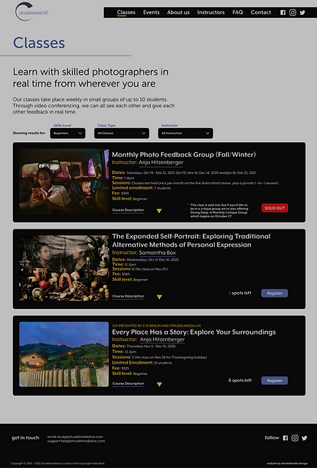
Images to the right:
StrudelmediaLIVE Homepage (2020) and CUNY Techworks Redesign


Project Focus
Increasing strudelmediaLIVE's visual design to attract new and younger students to remote photography lessons while making strudelmediaLIVE’s search experience easy and efficient for returning students.


Background
Founded in 2018 by Anja Hitzenberger, strudelmediaLIVE is an online photography class platform that connects students worldwide through Zoom. Anja's innovative approach allows her to continue teaching lessons effectively, even amidst challenging times like the quarantine. However, with the emergence of other prominent photography schools and companies offering online classes, Anja and Edward, the original creators of the website, recognize the need to update their platform to appeal to a younger international audience and stay competitive in the industry.
Note: To further increase registration, Anja and Edward discussed shifting classes to weekends, offering school scholarships, creating blogs and YouTube channels, and offering Photo_Talks.
Problem Space
Outdated design choices, such as too much text and low-quality images, negatively impact the current website’s attraction. At the same time, missing information contributes to distrust and an inefficient browsing and buying experience. I dove into doing literature research, competitive analyses, user testing, and surveys to better understand how to go about the redesign.
-
Heuristic Analysis
-
Assessing weaknesses and Opportunities of the website
-
-
Surveys
-
Understanding the wants of our users, current and new students
-
-
Usability testing
-
Locating the frustrations of new and current students
-
-
Behavioral analysis
-
Align market and strudelmediaLIVE student behavior
-
-
Handoff insights
Heuristic Analysis
After our initial client meeting, I determined that an initial heuristic analysis of the pages related to Anja and Edward's request for attraction would yield opportunities for evaluation.
Homepage
Classes
Photo_Talks
Registration
Using this flow sequence, I determined the main weaknesses or violations of the 10 Usability Heuristics for User Interface Design of the following pages while offering opportunities for improvement.

Examples of Questions and Tasks
The findings from these heuristics allowed us to focus the questions and tasks for usability test. With an emphasis on understanding how current students use strudelmediaLive and what impression the website leaves on new users, I went in to analyze student behavior via survey.
-
How would you describe the visual aesthetic you would look for in a website offering photography classes?
-
If you are a photographer with advanced skills, can you find a class that suits your skill level?
-
Can you find out more about the class of your choosing and the instructor?
Survey
User Priorities
User frustrations via survey highlighted an overlap in locating classes and teachers that align with their schedules, interests, and skill levels.
Most relevant to our client's request to attract new students, I learned that potential students focused greatly on visual design. 92.9% of 26 new students prioritize visual appeal when exploring a website for photography classes.


Usability Testing
Validating Client User flow
Usability testing revealed a more genuine experience for current and new students visiting the website. The Photo-talks page did not play a significant role in registration or familiarizing oneself with strudelmediaLIVE. Instead, The usability test further underscored that students were concerned with accessing classes based on skill level, previewing teacher bios and classwork, and making efficient purchases.

Behavioral Analysis
Visual Design & Website Credibility
While noting that 92.9% of 26 potential students prioritize visual appeal when exploring a website for photography classes, I determined that one of Strudel Media Live's most significant visual attraction issues is that it does not immediately convey that it is a site that offers classes, talks, etc., about photography.
I valued this input because visual appeal is just as important as the content/ product a company offers. As summarized in Brendan Hufford's 20+ Web Design Statistics You'll Need to Create the Perfect Website for 2020, which pulls from multiple studies, we have learned:
Poor Design Decreases Attraction
Coupled with a 50 millisecond judgment time and poor or outdated design choices, such as too much text, irregularly formatted links, distracting carousels, and low-quality images, the current website's visual design can decrease its attraction, especially among potential students.
-
75% of people base the credibility of a business on how its website looks ( Stanford Guidelines for Web Credibility)
-
First impressions are also 94% design-related, as seen in the table above. (Sillence et al., Trust and mistrust of online health sites )
-
It takes about 50 milliseconds for visitors to form an opinion on your website ( Lindgaard et al. Attention Web designers)

Poor Design Hinders Usability & Website Usage
Through survey and usability testing, I noted that students, current and new, wanted to customize their searches for a seamless location and purchases of their desired class. When analyzing the commercial nature of the website, registering or "buying" a class, I found that
-
60% of shoppers say website usability is essential for them (Statista)
-
44% of website visitors will leave a company's website if there's no contact information (Komarketing)
-
90% of information transmitted to the brain is visual
-
92.6% of people say the visual dimension is the #1 factor affecting their purchase (over taste, smell) (How color affects Conversions)
Visuals play a critical part in the buying process and website attraction. Specifically, the inclusion of contact information (user recognition, error prevention) paired with seamless user expereince (availability, accessibility, clarity, learnability) elevates the experience of visiting and buying on a website.
Handoff Insights
At the end of my research, I was able to fully validate the frustrations of both current and potential students and make the following suggestions for improvement for my group. As shown in the high-fidelity designs, my research was used to determine how the updated pages would appear.

Success
Clients, current students, and special guests responded positively to updates specific areas for improvement.


Next Steps
The redesigns focus on making the website more visually attractive and easy to navigate. To achieve the goal of attracting more international students, I would advocate for the following:
-
Localization
-
Auto-populate class hours based on the student's local time zone for convenience
-
-
Highlight Appealing classes
-
Package and emphasize classes that will most appeal to your target audience.
-
-
Video Tutorials
-
Curate or create short video tutorials to guide beginner photographers to your website and classes.
-

